Tech Talk
Customer-Driven Development
By Paul Williamson - Principal Software Engineer
MusicLife development started in 2014. At the time, the scope for the app was fairly narrow: facilitate playback to a product using UPnP. There were a number of design decisions taken with this in mind. Over time, more features needed to be added: Google Cast playback, streaming services and so on.

While these new features were a net benefit to customers, they came at the expense of adding complexity to the app.
You only get one chance at a first impression of using a product, and the more you work with the product, the farther you are from that first impression. Usage flows that make sense to you with your experience may not make sense to a new customer that has no experience with the product.
Design Decisions
We are always looking for ways to improve the user-experience and were aware that some customers were not finding the app immediately intuitive. It's not always easy for customers to quantify why a user experience is difficult to navigate, but through some hard work by Customer Service, Sales and Research & Development, we were able to build a picture of the main blockers our customers encountered.
We had already intended to redesign the flow of the app, but we wanted to ensure we were doing this for the right reasons rather than just for the sake of pushing pixels to get something new.
A few months ago, a customer reached out to us asking if there was a way to reduce friction from app launch to playing a radio station. This was the final piece of the puzzle that heavily influenced the design decisions we were to make in the redesign – and yes, we really do consider all the suggestions and feature requests our customers make!
Analysis
To begin, we took radio playback as a starting point and focused on how much interaction was required to begin playback.
• Open MusicLife
• Tap Streaming Services
• Tap Radio
• Tap Favourites
• Tap on a radio station
• Tap Play Now
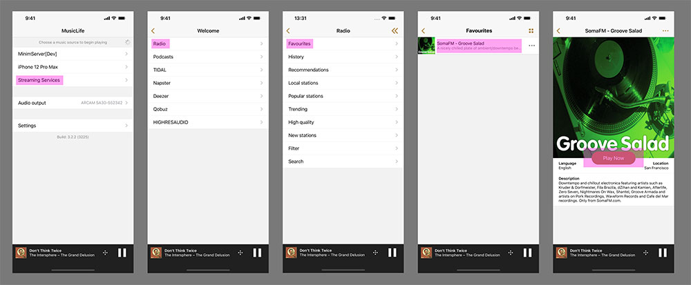
OLD VERSION: DIAGRAM SHOWING THE INTERACTIONS REQUIRED IN ORDER TO PLAY A FAVOURITE RADIO STREAM.
Assuming that you had previously used the app with a product and the app would reconnect to that product on launch, a total of six interactions were required to begin radio playback. While the steps above would only take 10-15 seconds to perform, we still felt like this could be optimised.
So how could we streamline this flow?
First Steps
A quick and easy first step was to flatten the streaming services menu – adding the different services directly to the home screen. That reduces one interaction already.
The average customer may have a handful of radio stations they regularly listen to, so how can we make it easier to jump directly to these stations? The most efficient way would be to allow customers to add specific stations directly to their home screen. This significantly streamlined the number of interactions required:
• Open MusicLife
• Tap your favourite radio station
• Tap Play Now
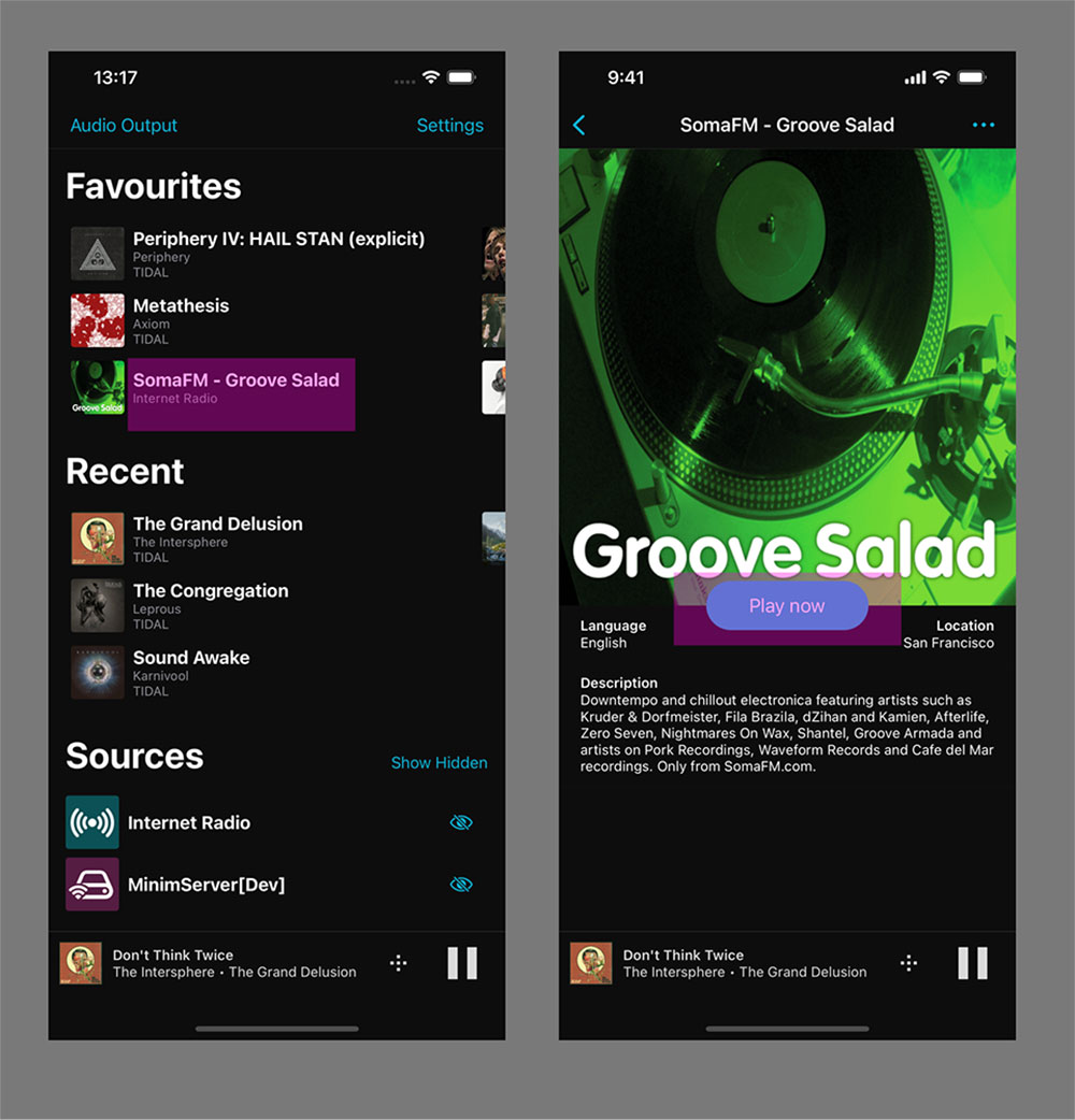
DIAGRAM SHOWING THE REDUCED NUMBER OF INTERACTIONS NEEDED IN THE REDESIGNED APP.
Great! So how do we extend this simplification? Well, a good start is by expanding the same home screen persistence feature to albums and playlist. This required a little more thought as we can't make any assumptions about what streaming service, or UPnP server a customer may prefer, so we have to support all options transparently.
At this point we were acutely aware that displaying all this extra data in a single-column list view was an inefficient use of the limited space available. Instead, by separating the data out into a grid view we were able to make the user experience cleaner and simpler, while still ensuring a customer could jump easily to the content they wanted.
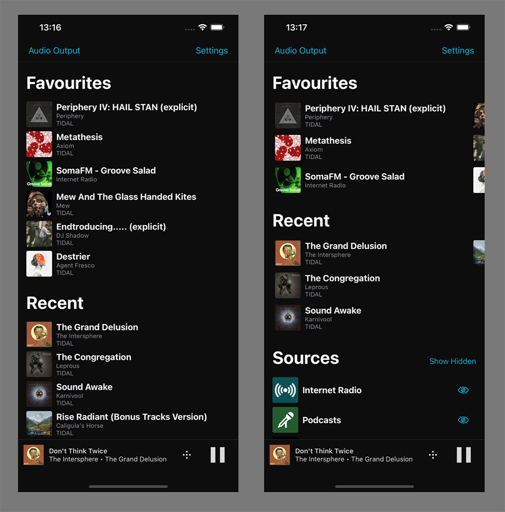
LEFT: SINGLE COLUMN VIEW; RIGHT: GRID VIEW.
Responding to Feedback
At this point we pushed out an alpha build to our internal stakeholders to physically try out the design. We feel the hands-on approach gives a much more natural 'feel' for using an app than static design images.
During this initial test, one of our Quality Assurance engineers suggested we expand the home screen to also include recently played items. This made it much easier to discover new favourites and quickly access content that is in heavy rotation.
Unlike favourites however, this section is ephemeral. Over time older content will be replaced by new content, so it makes sense to pair this with the favourites section.
We decided to limit the recently played items to whole 'containers', for example; an album, playlist, podcast or radio station, in order to prevent polluting the recently played sections with single songs, and therefore reducing its usefulness.
Exploring all Options
Now we felt like we had a much-improved experience for the vast majority of our customers, but we didn't want to stop there. How could we improve the experience for some of the edge cases? Consider the following use case – a customer who predominately plays content from a UPnP server, with occasional radio playback.
The current layout would show six streaming services that the customer doesn't use. While leaving the services on screen helps familiarise a customer with the services available to them, if they have no intention of using streaming services, then it is a waste of space.
The result was we added the ability to hide services a customer does not need, which provides a much cleaner look overall.
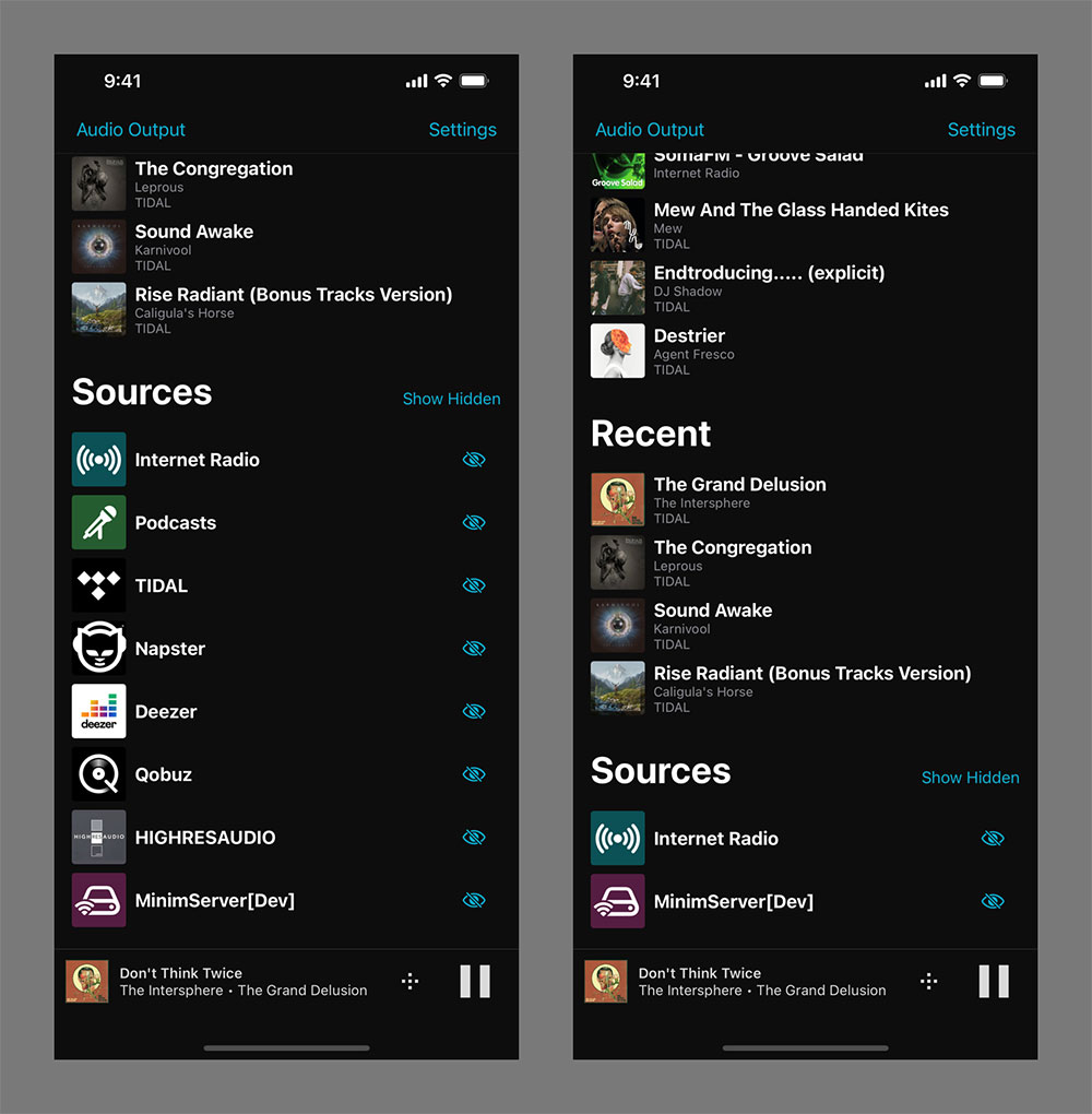
LEFT: HOME SCREEN SHOWING ALL AVAILABLE SOURCES; RIGHT: FILTERED SOURCE LIST.
Of course, in the future, a customer may decide to subscribe to a streaming service, so we also added the ability to "Show Hidden" services so the visibility can be toggled at a later date.
Summary
Redesigning an app is not a decision that can be taken lightly. While it is fairly easy to iterate mobile apps and continuously deliver updates, you need to be acutely aware of how your changes may affect customers.
Improving the ease of use for new customers makes a lot of sense, but these same decisions can alienate or confuse customers with a long history of using the app. Ensuring existing customers can still find their way through the app is equally important.
Overall, we feel like we have achieved the goals we initially set out, and initial feedback from small test groups has been very positive. Listening carefully to customer feedback and reacting appropriately has huge benefits for both the end customer and business at large.